

That exposure is exactly why so many people feel uncertain about it. Will it look cold? Sterile? Like a hospital waiting room? The fear is real, but it's based on a misunderstanding of what makes white interiors succeed. The difference between a flat, lifeless white room and a richly layered, luminous one comes down to a handful of intentional choices — the right shade, the right textures, the right moments of contrast.
This guide covers all of it: how to choose the correct shade of white for your space, how to build warmth through material layering, and what to do room by room. By the end, you'll have a clear picture of how to approach an all-white interior with confidence rather than guesswork.
Key Takeaways
- White undertones vary widely — pick the wrong one for your light and the whole room reads off.
- Texture functions as color here: material contrast does the work that hue contrast usually handles.
- Layering different shades of white adds depth; matching them exactly creates flatness.
- Natural materials (wood, stone, woven fibers) provide warmth that paint alone cannot.
- White won't save a poorly planned layout or bad lighting — those problems read just as clearly in white as in any other color.
Why All-White Interiors Are (and Always Will Be) In Style
Color trends move fast. Saturated greens, terracotta, moody blues — they surge, dominate shelter publications for 18 months, then fade. White doesn't participate in that cycle.
ELLE Decor describes white as a "timeless backdrop" for kitchens, bedrooms, and bathrooms — the "universal fallback" precisely because it suits every aesthetic equally. Minimalist, coastal, farmhouse, maximalist, contemporary, traditional — white works as the foundation for all of them. That adaptability is what separates a classic from a trend.
The Psychology of White Spaces
White is associated with calm and clarity. Architectural Digest quoted designer Elizabeth Muraro Hague noting that "soothing, uncomplicated white helps keep visual stimulation to a minimum." In a home environment where people go to decompress, that low-stimulation quality matters well beyond aesthetics.
White doesn't compete with other colors — it underlies them. It's the canvas you build a room on, not the room itself, which is why designers return to it regardless of what else is happening in the market.
Trend vs. Classic
ELLE Decor's 2023 color forecast declared that "gone are the days of straight-laced, all-white rooms" in favor of saturated tones for self-expression. That's trend commentary, not evidence that white is finished. Bold color has always cycled in and out. White is the constant that makes those cycles possible — the neutral ground designers and homeowners return to when a space needs to breathe again.
Start at the Foundation: Choosing the Right Shade of White
Here's what catches most people off guard: white is never truly neutral. Every shade carries an undertone — warm (yellow, cream, peach), cool (blue, gray, green), or near-pure — and selecting the wrong one for your space is the single most common reason white interiors feel wrong.
The undertone interacts with everything already in the room: your flooring, your cabinetry, your furniture, your light sources. Pick a white with a gray undertone for a warm, wood-heavy room and the whole space will read muddy. Pick a creamy yellow-toned white in a room with cool marble surfaces and you'll get visual dissonance that's subtle but persistent — a friction you sense without being able to identify it.
Matching Undertones to Your Materials
A useful rule of thumb:
- Warm whites (cream, yellow, peachy) — pair naturally with wood, cane, leather, aged brass, and earthen finishes
- Cool whites (blue, gray, green undertones) — complement stone, concrete, steel, and contemporary architecture
- Near-pure whites — work well in spaces with minimal existing materials, where you control everything from scratch
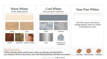
Before selecting a shade, read the room. Look at your flooring, your fixed finishes, your hardware. Those are the anchors. Your white should harmonize with them, not compete.
Room Orientation and Natural Light
Direction matters more than people expect. According to Benjamin Moore, north-facing rooms receive cool, blue-gray light — warmer-toned whites help counterbalance that coolness. South- and west-facing rooms get stronger, warmer light and can handle crisper, cooler whites without reading harsh.
The same paint chip will look completely different at 8am versus 4pm. Farrow & Ball recommends painting movable card samples and placing them in different parts of the room, checking throughout the day and under both natural and artificial light. Skip this step and you're committing to a color you've never actually seen in your space.
The Ceiling and Trim Strategy
Using the identical white across walls, ceiling, and trim is one of the most common mistakes in white interiors. The result is flat and unfinished — no depth, no architecture.
Instead: introduce subtle tonal shifts. A slightly warmer white on trim catches the eye and defines the room's edges. A slightly cooler, lighter white on the ceiling visually lifts the space. The palette stays white; the room gains dimension.
This is where seeing the actual finish in context — before paint goes on the wall — changes everything. Design in Rhythm confirms exact paint selections and sources all finishes before producing photorealistic 3D renderings, so clients see precisely how each white performs in their specific space, under their specific light, before any commitment is made.
The Secret to Warmth: Texture, Layering, and Material Mix
Remove chromatic contrast from a room and something has to take its place. In a white interior, that something is texture. Material contrast becomes the visual engine — the interplay between matte and sheen, rough and smooth, handmade and refined. This opens up a kind of richness that color-led rooms rarely achieve.
Texture Pairings That Work
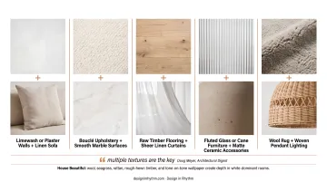
These combinations succeed because each surface catches light differently, creating visual rhythm without introducing new color:
- Limewash or plaster walls + linen sofa
- Bouclé upholstery + smooth marble surfaces
- Raw timber flooring + sheer linen curtains
- Fluted glass or cane furniture + matte ceramic accessories
- Wool rug + woven pendant lighting
As designer Doug Meyer told Architectural Digest, "multiple textures are the key" to keeping a monochromatic room from reading flat. House Beautiful's white-room documentation confirms the same: wool, seagrass, rattan, rough-hewn timber, and tone-on-tone wallpaper are recurring tools for depth in white-dominant spaces.
Layering Whites
Mismatching shades and finishes is a feature, not a flaw. Cream bedding against bright white pillowcases. An off-white wool rug on a brighter white floor. Ivory upholstery beside pure white walls. These tonal differences add dimension — they don't read as mistakes when they're done with intention.
Benjamin Moore notes that sheen ranges from flat/matte to high gloss, with each level changing light reflection and how color appears. Matte walls, satin trim, and a gloss-painted ceiling all read as "white" while giving the room architectural variety.
Bringing in Natural Warmth
No paint color alone solves the warmth problem. Natural materials — wood, stone, woven fibers, live plants — introduce the organic quality that white interiors need to feel inhabited rather than constructed.
The goal is to borrow from the outside: grain, growth, age, irregularity. A live-edge walnut table. A terracotta planter. A hand-thrown ceramic bowl. These pieces counterbalance the precision of an all-white palette in a way that synthetic materials cannot.
Sourcing matters here. Design in Rhythm's vendor and artisan network — built over more than a decade — provides access to custom plaster finishes, handwoven textiles, and one-of-a-kind furniture that most retail channels don't carry. That material specificity is what distinguishes a considered white interior from a room that simply got painted white.
All-White Room-by-Room: Ideas and Inspiration
White behaves differently in every room because every room has different functional demands. The goal — warmth, depth, intentionality — stays constant. The strategy shifts.
Living Room
The white living room works best as a gallery: white walls allow furniture forms, rugs, art, and the people in the space to become the focal points. Recommendations:
- Choose a soft-sheen sofa in performance linen or bouclé
- Layer lighting — overhead on a dimmer, task lamps, accent lighting
- Anchor the room with a statement rug
- Introduce one or two contrasting tones (dark timber, aged brass, or a single black piece) to give the eye a resting point
Without those contrast moments, the room can feel undefined. Too much contrast and it stops reading as white-dominant. That same principle guides every other room in the house.
Bedroom
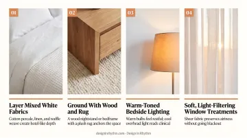
In a white bedroom, the goal is sensory softness. A few choices make the difference between a room that feels restful and one that feels sterile:
- Layer bedding in mixed white fabrics — cotton percale, linen, waffle weave — for hotel-like depth
- Ground the space with a wood nightstand or bedframe and a plush rug underfoot
- Use warm-toned bulbs in bedside lamps; cool overhead light reads clinical in an all-white room
- Keep window treatments soft and light-filtering rather than blackout, to preserve the airy quality
Kitchen
White kitchens gain richness through material variation. Matte cabinetry against glossy subway tile. A natural stone countertop with visible movement. Open shelving in warm wood. Unlacquered brass hardware.
At least one surface should introduce natural texture or grain. Without it, the uniformity reads like a showroom. As designer Elizabeth Roberts notes, counters and hardware do the visual "heavy lifting" in white kitchens — the cabinetry recedes and the materials at eye level define the space's character.
Bathroom
The white bathroom is the most natural application of this palette — clean, spa-like, and genuinely timeless . The key is layering finishes:
- Polished marble against matte plaster walls
- A freestanding tub in matte white on a textured tile floor
- Aged nickel or unlacquered brass fixtures for warmth
- A teak stool, woven basket, or living plant for organic life
Houzz's white-and-wood bathroom documentation describes timber as making white bathrooms warmer and more inviting — a small addition with outsized effect.
Common Mistakes That Make All-White Interiors Look Flat
Mistake 1: No Tonal Variation
Using identical white across walls, ceiling, trim, and furniture creates a washed-out, unfinished look. The fix: introduce subtle shifts between surfaces, vary finishes (matte walls, satin trim), and layer whites with different undertones.
Mistake 2: Skipping Texture
A white room without material variation looks unpainted, not designed. Commit to at least three distinct textures in every room — one on the walls, one in the furniture, one in soft furnishings — and ensure they respond to light differently.
Mistake 3: Using White as a Fix
Architect Sarah Jacoby was direct about this: "White doesn't make things bigger, it just makes it white." A poorly planned furniture layout, inadequate lighting, or a lack of warmth-building elements will be just as visible in white as in any other color — possibly more so, because white removes everything to hide behind.

That means treating a white interior with the same rigor as any color-led space. Working with a designer who sources materials and confirms finishes before the first wall is painted matters here more than anywhere else. Design in Rhythm confirms every finish before renderings are produced — so clients see the resolved design, not a placeholder, before any decision locks in.
Frequently Asked Questions
Does an all-white room look good?
Yes — but the result depends entirely on execution. All-white rooms look exceptional when they use intentional texture, material layering, warm undertones, and moments of contrast. Paint everything the same white with no variation in material or tone, and the room reads cold and lifeless.
Is an all-white house still in style?
White is a timeless, foundational color that sits above trend cycles. Designers return to it cycle after cycle — not because it's safe, but because it works as a backdrop for virtually any material, light condition, or style direction.
What makes a home look outdated?
In white interiors: flat cool whites with no tonal variation, no texture, and uniform palettes with no contrast or natural warmth. When every surface shares the same finish and shade, the room dates itself fast.
What is the 3-color rule in interior design?
The 60-30-10 rule assigns 60% to a dominant color, 30% to a secondary, and 10% to an accent. In a white interior, white anchors the 60%, a warm neutral like wood tone or stone fills the 30%, and a single contrasting accent — aged brass or dark timber — handles the 10% without breaking the overall palette.